KOKO Kombucha
Branding / User interface / Coding / OOH
Link to Website : Coding Works
Link to p5.js: Coding works
Link to Website : OOH (Click the screen to start playing.)


Product Performance
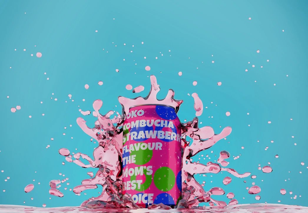
KOKO Kombucha is a distinguished brand that excels in expertly producing beverages using pristine ingredients sourced from nature and employing time-honored fermentation techniques. Our commitment to crafting revitalizing drinks sets us apart, profoundly impact your well-being and lifestyle.
The Mission
This brand is dedicated to supporting health-conscious communities, especially young mothers and their families, in maintaining a wholesome diet. KOKO aims to become an appealing product for a wide range of consumers, boasting diverse and rich flavors coupled with a modern and environmentally-friendly design. Its mission is to understand the needs of various cultures and generations of consumers and assist them in effortlessly embracing wellness with ease, freshness, and vitality in their daily lives.
Creative Direction
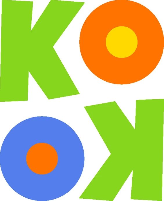
In alignment with the brand's name, KOKO Kombucha has ingeniously modified the typography of the letter 'O' in the logo to resemble the effervescent bubbles found in the sparkling carbonation of kombucha.
The logo incorporates vibrant orange, green, and blue colors, symbolizing the key natural ingredients of kombucha, thereby showcasing the brand's identity. Placing KOKO upside down adds a playful and dynamic touch, ensuring its conspicuous presence among other beverages in the refrigerated section of grocery stores, effectively fulfilling its mission of promoting consumer health.